Internal reference
Career Discovery Brand & Design Guide
This page documents the design system exactly as it is implemented on the public pages today. It is a record of what already works, not a new direction. Nothing here is invented: every colour, size, radius and pattern below is taken from the live code.
00
How to use this guide
Career Discovery has one visual language. This page is its source of truth.
- Look here firstBefore any new UI work, read this guide and reuse the documented patterns rather than designing from scratch.
- The guide winsIf a requested design conflicts with the guide, preserve the guide unless Anna explicitly asks for an exception.
- No convenience patternsDo not introduce a new pattern simply because an existing one is inconvenient for the layout you are building.
- Copy is a constraintNever rewrite, shorten, smooth or paraphrase approved copy to make it fit. Adapt the layout to the copy.
- Reuse the componentsBand, Pill, PillLink, WhitePanel, QuestionDeck and ReportVideo already exist. Import them instead of restyling copies.
- One instruction“Follow /brand-guide exactly. Do not introduce new design patterns.”
01
Brand foundations
Ten colours. There is no eleventh. Every surface, border and accent on the site comes from this set, defined as CSS variables in src/styles.css.
Primary navy
#16235A
Token
--navy / --primary / --blue· classbg-navy, text-navyHeadings, body emphasis, navigation, contrast bands, the offer panel, navy buttons.
Not for: Long body paragraphs on cream (use body text), and back-to-back full-height bands.
Deep navy
#0F1A45
Token
--navy-deep / --blue-deep· classbg-navy-deepThe footer band and navy button hover, where a step down from primary navy is needed.
Not for: Large content sections; it reads heavier than primary navy and flattens the page.
Cream
#F7F4EC
Token
--beige / --secondary / --muted· classbg-beigePage background, alternating editorial sections, inner surfaces of report thumbnails, avatar circles.
Not for: Text colour, and stacking two cream bands in a row with no white or navy between them.
White
#FFFFFF
Token
--background / --card· classbg-background, bg-cardCards, working surfaces, the header, and sections that need to feel like a clean sheet.
Not for: Text on cream or white, and full pages of stacked white cards with no cream breathing room.
Orange brand
#E8A93B
Token
--brand / --accent· classbg-brand, text-brandPrimary CTAs, vertical markers, card top rules, check icons, the emphasised methodology badge.
Not for: Backgrounds of whole sections, body text, or decorative fills with no meaning.
Orange deep
#D0942A
Token
--brand-deep· classbg-brand-deep, text-brand-deepHover state of the orange CTA, eyebrow labels, editorial italic accents, numerals in lists.
Not for: Large filled areas; it is a hover and text-accent colour, not a surface.
Soft orange tint
#FAF0DC
Token
--brand-soft· classbg-brand-softRare, very light highlight fill where cream is not distinct enough.
Not for: Any use that competes with cream as a section background.
Body text
#17171A
Token
--foreground· classtext-foregroundRunning body copy at 15-17px on cream and white.
Not for: Headings (they are navy) and text on navy (that is white or white/85).
Muted text
#55555E
Token
--muted-foreground· classtext-muted-foregroundDisclaimers, captions, secondary notes, deprecated examples.
Not for: Primary reading copy, or anything the user must not miss.
Border
#E3E1DA
Token
--border (strong: #B9B6AC)· classborder-border, border-navy/10Card outlines and section rules. On cream and white use border-navy/10; on navy use border-white/10.
Not for: Heavy or dark borders, and using a border where whitespace already separates content.
02
Typography
Two families. Playfair Display carries emotion and hierarchy, Inter carries information. Examples below use live Career Discovery copy.
Playfair Display - font-display
Find the career direction that fits you
- Role
- H1, page hero only, one per page
- Size
- clamp(34px, 5vw, 56px)
- Weight / line-height
- 500 · 1.08
Four steps. One clearer picture.
- Role
- H2, section title inside a band
- Size
- clamp(26px, 3.2vw, 36px)
- Weight / line-height
- 500 · 1.15
Sample questions from the process
- Role
- H3, sub-section inside a band
- Size
- 24px fixed
- Weight / line-height
- 500 · 1.25
Career Discovery™ a new way to get unstuck.
- Role
- Editorial accent, the display-italic utility
- Style
- Playfair italic, weight 500, brand-deep
- Use
- One accent phrase per heading, never a whole sentence
Inter - font-sans
A guided online process that analyses your CV, asks the questions a good coach would ask, and gives you 5 to 9 realistic directions with the trade-offs of each.
- Role
- Lead paragraph, directly under H1
- Size / line-height
- 17px · 1.7
- Measure
- max-w-[70ch]
A look inside the journey: the kind of questions you will answer, the reports you will receive, and how your progress is organised along the way.
- Role
- Body copy
- Size / line-height
- 16px · 1.7 (15px · 1.65 inside cards)
- Colour
- foreground on cream and white, white/85 on navy
whether by choice or not, and you want to use the moment to find a direction that genuinely fits.
- Role
- Small body, list detail and captions
- Size / line-height
- 13.5px · 1.65
THE METHODOLOGY
- Role
- Eyebrow label above a section title
- Spec
- 12px · 700 · uppercase · 0.14em tracking
- Class
- eyebrow utility, colour text-brand-deep (text-brand on navy)
My Journey
- Role
- Header navigation link
- Spec
- 12.5px · 600 · uppercase · 0.1em, hover brand-deep
Start Career Discovery
- Role
- Buttons and labels
- Spec
- Buttons 15px · 600 (13.5px for Pill), labels 11-12px uppercase
03
Page layout
One container width, one set of side margins, and the tighter vertical rhythm established on the landing page.
Container
- Max width
- max-w-6xl (72rem / 1152px) inside every Band
- Wide page
- PageFrame wide, max-w-6xl main column
- Narrow page
- PageFrame default, max-w-3xl for reading pages
Side margins
- Mobile
- px-6 (24px)
- Desktop
- md:px-10 (40px)
- Full bleed
- Band escapes the container, the inner div keeps the margins
Band spacing
- Default
- pt-10 pb-14 md:pt-12 md:pb-16
- Tight band
- pt-8 pb-10 md:pt-10 md:pb-12
- Rule
- Bottom padding is always larger than top padding
Grid gaps
- Cards
- gap-4 to gap-6
- Two-column rows
- gap-8 md:gap-12
- List items
- gap-x-8 gap-y-5
Two-column layouts
- Content + media
- md:grid-cols-2, or md:grid-cols-[1.05fr_0.95fr]
- Content + panel
- lg:grid-cols-12 with 8 / 4 split, gap-10 lg:gap-14
- Order
- md:order-1 / md:order-2 to alternate media side
Three-column layouts
- Pattern
- grid gap-4 md:grid-cols-3, or sm:grid-cols-2 lg:grid-cols-3
- Equal height
- auto-rows-fr with h-full on the card
- Mobile
- Single column first, never a horizontal squeeze
Vertical rhythm rule: sections open close to their heading and breathe underneath. Never add large empty space above a heading to “balance” a band.
04
Backgrounds & section rhythm
Sections alternate deliberately. Cream is the resting state, white is the working state, navy is the emphasis state.
Cream section
Editorial default. Use for narrative sections, testimonials and the look-inside content. White cards sit on top of it with clear separation.
White section
Clean sheet. Use where the content is structural: methodology, what you receive, product detail. Cards on white rely on cream inner surfaces or a light border.
Navy section
Emphasis. One per stretch of page: qualification, organisations, final CTA. Text is white, secondary text white/85, borders white/10, accents orange.
Split navy / cream
A navy panel inside a light band, as used for the offer next to the methodology grid. This is how navy enters a light section, rather than a cream card floating in a navy slab.
Rhythm rule: cream → white → cream → navy. Never place two large navy bands close together, and never let navy become the page background.
05
Cards
Six approved card patterns. New sections pick one of these, they do not introduce a seventh.
Standard content card
Career Identity
Understand who you are professionally today, including experience, strengths, motivators, preferred work, environment and recurring patterns.
- Background
- White (bg-background)
- Border
- border-navy/10
- Radius
- rounded-[18px]
- Padding
- p-6 (p-5 in tighter grids)
- Typography
- 17px semibold navy title, 15px/1.65 body at navy/80
- Shadow
- None
Testimonial card
“It helped me make sense of my current situation and become much more specific about how I present my experience and which roles I target now”
- Background
- White
- Border
- border-border with border-t-[3px] border-t-brand
- Radius
- rounded-2xl
- Quote
- Playfair 15.5px/1.5 navy, curly quotation marks
- Avatar
- 40px circle, photo or initials on cream
- Shadow
- None
Methodology / process card
Career Directions
You receive report with 5-9 career directions
Identify realistic career directions, longer-term possibilities, trade-offs and the strongest relationship between what fits and what is feasible.
- Structure
- Optional orange badge, title, uppercase meta line, body
- Badge
- bg-brand, 10px bold uppercase navy, rounded-full
- Meta
- 12px uppercase navy/60
- Grid
- auto-rows-fr with h-full so cards match height
Offer / pricing panel
Start your Career Discovery
- about 90 focused minutes of your time to answer tailored questions that make you think
- 4 personalised reports
- Complete in one or several sessions
€135
incl. VAT
- Background
- Navy, radius rounded-[20px]
- Padding
- p-8 md:p-10
- List
- Orange Check icons, 15px/1.6 white/90
- Divider
- border-t border-white/10, pt-8
- Price
- Playfair 34px, VAT line 11px uppercase white/50
Report preview card
- Frame
- White, rounded-xl, border-navy/10, p-3
- Page
- Cream 3:4 area with orange marker and navy/10 text lines
- Caption
- 13px semibold navy
Sample-question card
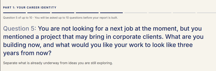
- Component
- QuestionDeck (src/components/question-deck.tsx)
- Frame
- White, rounded-[20px], border-navy/10, p-4 sm:p-5
- Shadow
- The one approved soft shadow, on screenshot frames only
- Controls
- 40px orange round arrows, disabled at 30% opacity
Primary orange CTA
- Shape
- rounded-full, px-7 py-3
- Type
- 15px semibold (13.5px for Pill)
- Default
- bg-brand, text-navy
- Hover
- bg-brand-deep, text-white
- Focus
- Default ring token (--ring #16235A)
- Disabled
- opacity-40, cursor-not-allowed
Secondary CTA
- Outline
- border border-navy, hover fills navy with white text
- Quiet
- border-navy/35 on white, hover border-navy and cream fill
- Navy
- bg-navy, hover bg-navy-deep
- Component
- Pill / PillLink (src/components/layout.tsx)
Text link
- Spec
- 14px semibold navy, underline, underline-offset-4
- Hover
- text-brand-deep
- Use
- Inline continuation, never as a replacement for a CTA
Navigation link
- Spec
- 12.5px semibold uppercase, 0.1em tracking, navy
- Hover
- text-brand-deep
- Placement
- Header right side only, gap-6
Large PillLink
- Large
- px-10 py-4, 15px
- Default
- px-7 py-3, 13.5px
- Use
- Large only for a single decisive action in a band
07
Brand details
The small marks that make the pages recognisable. Each has a specific job.
Orange vertical marker
- Spec
- h-5 w-[1.5px] bg-brand
- Use
- The standard bullet mark for every list
Orange short rule (deprecated)
- 4 personalised reports
- Complete in one or several sessions
- Spec
- h-[1.5px] w-4 bg-brand
- Do not use
- Horizontal lines are no longer used as bullets. Use the orange vertical marker instead.
Orange top rule
A 3px orange top border marks a quoted or highlighted card. One per card, never combined with a coloured background.
A LOOK INSIDE
Eyebrow labels open a section and name it. Brand-deep on light, brand on navy. Never two eyebrows in the same block.
Divider & quotation
“It helped me make sense of my current situation and become much more specific about how I present my experience and which roles I target now”
A left orange rule marks a closing or reflective note.
Icons & price
€135
incl. VAT
- Icons
- lucide, 20px, strokeWidth 2.5, orange, functional only
- Price
- Playfair 34px with an 11px uppercase VAT line
08
Real page components
Live examples of the patterns in production. Pure presentational components are rendered directly; stateful, data-driven screens are shown as static examples with demo content.
Hero
Career Discovery™ a new way to get unstuck.
Find the career direction that fits you
A guided online process that analyses your CV, asks the questions a good coach would ask, and gives you 5 to 9 realistic directions with the trade-offs of each.
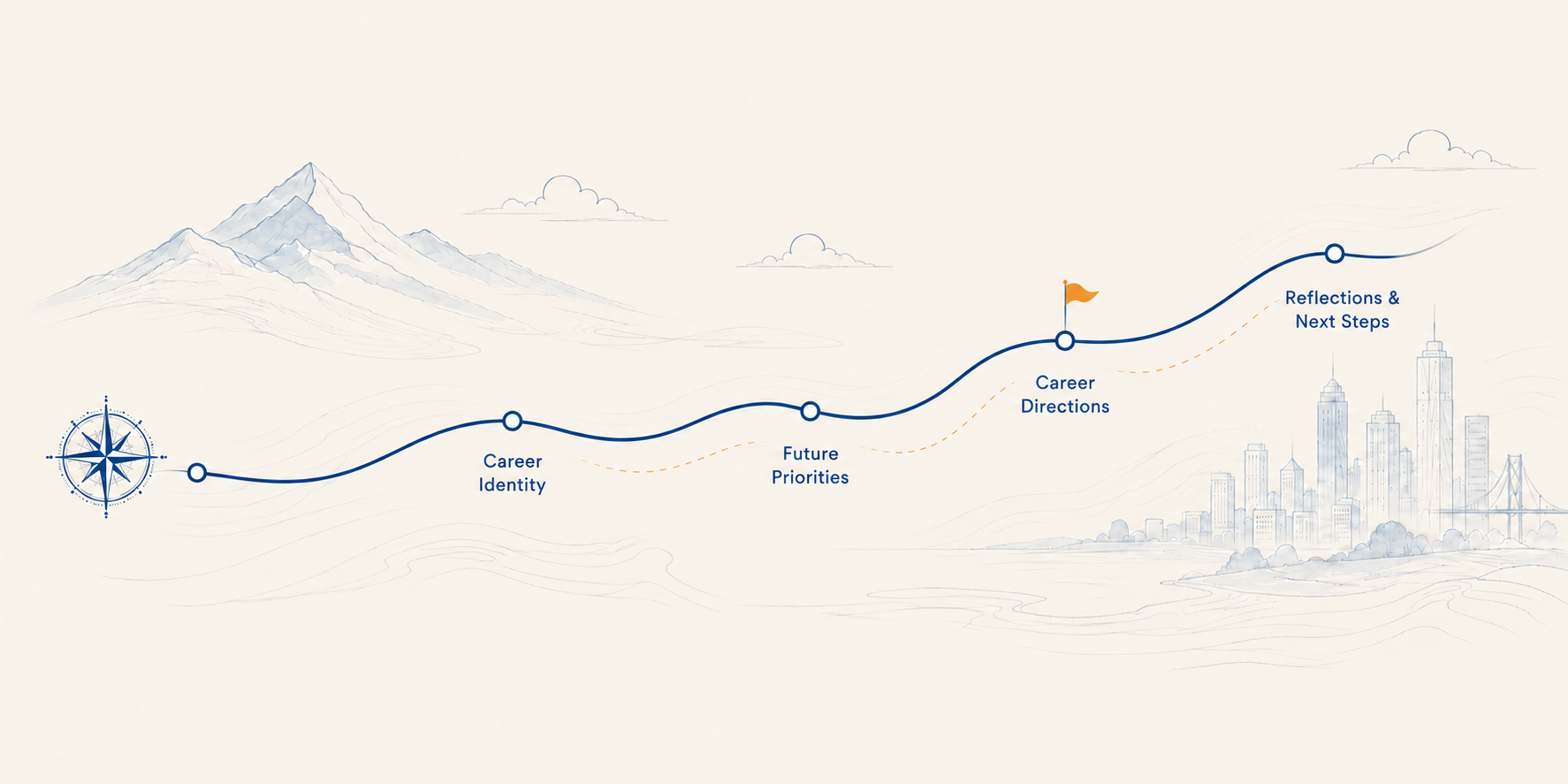
- Grid
- md:grid-cols-[1fr_0.9fr], gap-10
- Copy width
- max-w-[56ch]
- Order
- Kicker, H1, lead, then secondary + primary CTA
“For you, if…” item on navy
For you, if…
- You are looking for your next rolewhether by choice or not, and you want to use the moment to find a direction that genuinely fits.
- You have too many possible directions in your headand need to reach a point of clarity.
Methodology step + offer panel
01 Career Identity
45-60 min, report included
Understand who you are professionally today, including experience, strengths, motivators, preferred work, environment and recurring patterns.
02 Future Priorities
20-40 min, report included
Explore the future you are trying to build, including changing priorities, lifestyle, ambitions, values, interests and practical constraints.
Start your Career Discovery
€135
incl. VAT
Report preview (browser frame + video)
- Frame
- rounded-2xl, border-navy/10, cream title bar with three navy/15 dots
- Label
- 11px semibold uppercase navy/50
- Component
- ReportVideo (src/components/report-video.tsx)
Working surface (WhitePanel), static demo content
Career Identity · Question 3
Which parts of your current role do you find genuinely energising?
Demo content only. Interview, report and journey screens are data-driven, so this guide shows their styling with static text rather than live data.
- Spec
- rounded-2xl, border-border, bg-card, p-6 md:p-8
- Use
- Answers, forms and key content inside the app
Closing CTA band
Start your Career Discovery
3 months’ access to Career Discovery platform to work with more context and reflect on directions
Continue to purchase09
Preferred vs deprecated patterns
Where the codebase still contains an older, conflicting implementation, the preferred pattern documented here wins for all new work.
Preferred
Tighter band spacing
pt-10 pb-14 md:pt-12 md:pb-16, or pt-8 pb-10 md:pt-10 md:pb-12 for a tight band.
No longer reused
Large symmetrical vertical padding
Equal py-20 style bands leave dead space above headings and slow the page down.
Preferred
Subtle navy borders, minimal or no shadow
border-navy/10 on light, border-white/10 on navy. The only approved shadow is the soft one under screenshot frames.
No longer reused
Heavy card shadows
Drop shadows make the editorial surfaces feel like a generic SaaS dashboard.
Preferred
Navy as a deliberate single contrast band
One navy band per stretch of page, surrounded by cream and white.
No longer reused
Multiple large navy bands close together
Consecutive navy slabs remove contrast and make the page feel heavy.
Preferred
Methodology grid with the navy offer panel beside it
Light 8-column card grid plus a 4-column navy panel: navy enters a light section as a panel.
No longer reused
Floating cream card inside a large navy slab
Inverts the rhythm and makes the offer read as a pop-up rather than part of the page.
10
Do / Don't
Do
- Use generous but controlled whitespace
- Maintain clear hierarchy: eyebrow, heading, lead, detail
- Use navy and orange deliberately, as emphasis
- Use Playfair for emotional and editorial emphasis
- Keep cards simple: border, radius, padding, type
- Reuse the established components
- Keep sales CTAs visually clear
Don't
- Create huge empty spaces above headings
- Make every section navy
- Invent new shades of blue
- Use gradients unless specifically requested
- Add decorative effects or shadows unnecessarily
- Create new card styles without reason
- Shrink text to force content into a layout
- Rewrite approved copy to make a layout fit
- Centre everything by default
- Add generic SaaS styling
- Add icons merely for decoration
Do - left aligned, clear hierarchy
20-40 min, report included
Future Priorities
Explore the future you are trying to build, including changing priorities, lifestyle, ambitions, values, interests and practical constraints.
Don't - centred, shrunken, shadowed
Future Priorities
Explore the future you are trying to build, including changing priorities, lifestyle, ambitions, values, interests and practical constraints.
11
Copy principles
The tone already established on the public pages. This is a record of it, not a new tone of voice.
Human, intelligent, direct
“Find the career direction that fits you”
Specific, not generic
“45-60 min, report included”
Concrete, not abstract
“Identify realistic career directions, longer-term possibilities, trade-offs and the strongest relationship between what fits and what is feasible.”
Career language real people use
“Your manager is about to ask about your career plans and you dread the question: "What are your career aspirations?"”
Confident without exaggeration
“Users participated in an individual capacity. Career Discovery is not affiliated with or endorsed by these organisations.”
AI explained openly
“A guided online process that analyses your CV, asks the questions a good coach would ask, and gives you 5 to 9 realistic directions with the trade-offs of each.”
Also true of this voice
- Write full words: you will, you are, it is, do not
- Use a colon, a full stop or a comma where a long dash would sit
- Use the orange vertical marker as the bullet in every list
- Avoid generic AI and SaaS phrases
- Avoid unnecessary slogans
- Preserve the deliberate personality and humour already in the copy
Never
- Long dashes (em or en dashes) anywhere in copy
- Contractions such as you'll, you're, it's, don't
- Long horizontal lines as bullet points
- Automatically smooth or rewrite approved copy
- Shorten a sentence so it fits a card
- Replace a specific number or claim with a vaguer one
12
Design tokens & implementation
Developer reference. Everything below already exists; reference it rather than duplicating CSS.
Colour tokens - src/styles.css :root
| Token / class | Value | Used for |
|---|---|---|
--navy / --primary / --blue | #16235A | bg-navy, text-navy, --ring |
--navy-deep / --blue-deep | #0F1A45 | bg-navy-deep, footer band, navy hover |
--beige / --secondary / --muted | #F7F4EC | bg-beige page and section background |
--background / --card | #FFFFFF | bg-background, bg-card surfaces |
--brand / --accent | #E8A93B | bg-brand, text-brand accents and CTA |
--brand-deep | #D0942A | CTA hover, eyebrows, italic accents |
--brand-soft | #FAF0DC | Light highlight fill |
--brand-foreground | #17171A | Text on orange |
--foreground | #17171A | text-foreground body copy |
--muted-foreground | #55555E | Captions and disclaimers |
--border / --border-strong | #E3E1DA / #B9B6AC | border-border, border-border-strong |
--navy-muted | #C8CDDF | Muted navy detail |
--destructive | #B3261E | Errors only |
Typography tokens
| Token / class | Value | Used for |
|---|---|---|
--font-display / font-display | "Playfair Display", Georgia, serif | H1 - H3 and editorial accents, weight 500-600 |
--font-sans / font-sans | "Inter", Arial, sans-serif | Body, UI, buttons, labels; body line-height 1.6 |
display-italic | Playfair italic 500 | Accent phrase inside a heading |
eyebrow | 12px · 700 · uppercase · 0.14em | Section labels |
Section title | clamp(26px,3.2vw,36px) · 1.15 | H2 inside a Band |
Hero title | clamp(34px,5vw,56px) · 1.08 | H1 only |
Spacing, radii, borders, breakpoints
| Token / class | Value | Used for |
|---|---|---|
Band padding | pt-10 pb-14 md:pt-12 md:pb-16 | Default section band |
Tight band padding | pt-8 pb-10 md:pt-10 md:pb-12 | Dense list bands |
Container | max-w-6xl · px-6 md:px-10 | Band inner and PageFrame wide |
Narrow container | max-w-3xl | PageFrame default reading pages |
Grid gaps | gap-4 / gap-6 / gap-8 md:gap-12 | Cards / cards / two-column rows |
--radius | 0.75rem (12px) | Base radius; rounded-xl, rounded-2xl derive from it |
Card radius | rounded-[18px] / rounded-2xl / rounded-[20px] | Content card / testimonial / panel |
Button radius | rounded-full | All buttons and pills |
Borders | border-navy/10 · border-white/10 · border-border | Light surfaces / navy surfaces / dividers |
Breakpoints | sm 640 · md 768 · lg 1024 | Tailwind defaults, mobile first |
Reusable components
| Token / class | Value | Used for |
|---|---|---|
PageFrame | src/components/layout.tsx | Header, main container, footer band |
Band | src/components/layout.tsx | Full-bleed section with max-w-6xl inner |
WhitePanel | src/components/layout.tsx | White working surface, rounded-2xl |
Pill / PillLink | src/components/layout.tsx | Buttons: solid, quiet, navy; default and large |
TestimonialsSection | src/components/testimonials-section.tsx | Testimonial ribbon and card styling |
QuestionDeck | src/components/question-deck.tsx | Screenshot deck with orange arrows |
ReportVideo | src/components/report-video.tsx | Browser-framed report preview |
Follow this guide exactly. Do not introduce new design patterns.